SharePoint Web Parts
Microsoft 365

Web components are essentially elements within a page designed to showcase content. Think of them as building blocks that you arrange to construct a site page.
Behind the scenes, these web components function as compact applications responsible for storing and presenting specific types of content (which can vary depending on the specific web component).
Out of the box, SharePoint provides pre-built web components. Additionally, there are external web components accessible on Microsoft 365 that you can integrate into your site.
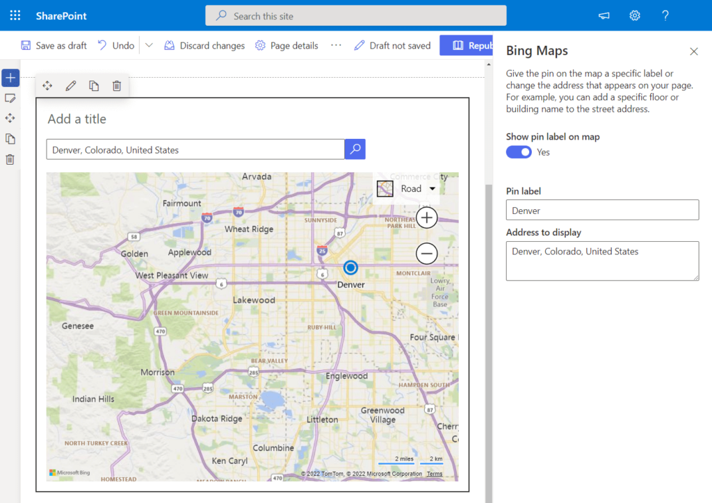
Mapping with Bing Maps
Utilize Bing Maps to showcase a map directly on your page. Simply input an address, location, or a well-known place name, and a corresponding map will be generated.
Choose from four map types:
- Road (standard)
- Aerial (detailed aerial view)
- Bird’s eye (enhanced aerial perspective)
- Streetside (street-level view)
When you pick a map type in edit mode, it becomes the default view on the page. However, visitors have the flexibility to explore various map types.
You also have the option to mark a specific location on the map, attach a label, and display the address above the map.
Button
This component enables you to incorporate a customizable button into your page, complete with your preferred label and link. Additionally, you have the flexibility to fine-tune the alignment of the button on the page.
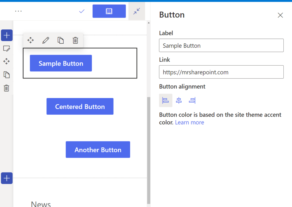
It’s worth noting that the button color cannot be modified in edit mode, as it is inherently tied to the site theme’s accent color.
Call to Action
If you’re seeking an enhanced button web component, the Engagement Prompt Web Component is the ideal choice. This versatile component empowers you to craft a call-to-action button tailored for users.
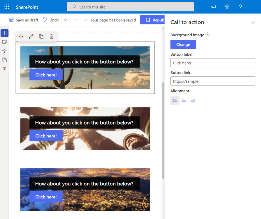
Distinguishing features of the call-to-action web component compared to the standard button web part:
- Incorporates the ability to add a background image.
- Allows for the inclusion of a call-to-action text positioned above the button.
Similar to the standard button web part, this component offers options for button alignment, label, and link customization.
Code Snipped
If you find the necessity to showcase code on your page, the Code Snippet Web Component is the perfect solution.
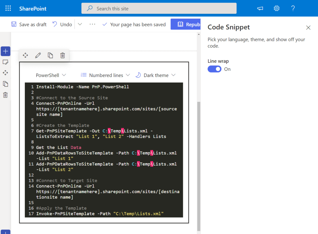
When employing this web component, you have the ability to customize the following options:
- Select the programming language (the web component will automatically detect the syntax).
- Choose whether to display numbered lines.
- Configure the color theme (opt for either a dark or light theme).
- Adjust line wrapping.
Additionally, the web component provides automatic syntax correction. It’s important to note that this web component is currently part of the target release program, meaning that access may not be universally available to all users at this time.
Office 365 Connectors
Are you leveraging third-party services such as GitHub and Trello? The Connectors Web Component provides a seamless solution to showcase messages, alerts, and notifications from external services directly on your page.
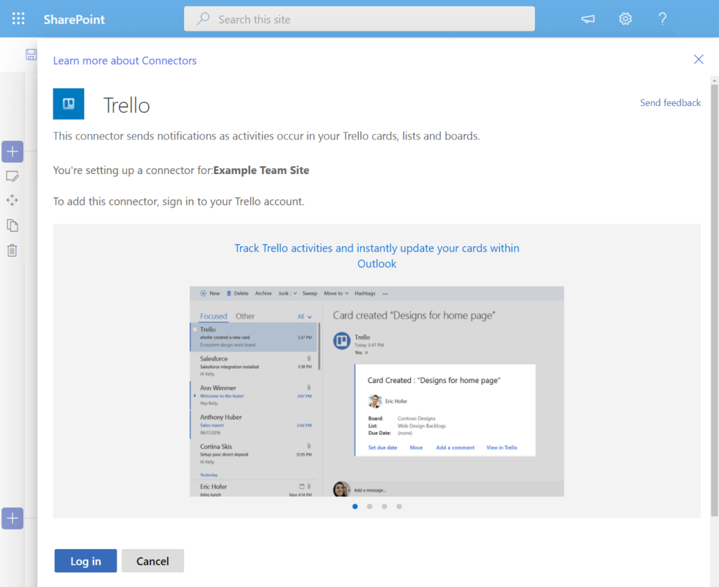
Highlighted features of the Connectors Web Component:
- Compatibility with popular connectors like MailChimp, Trello, Google Analytics, Intercom, and Dynamics 365.
- Exclusive availability for team sites.
- Currently part of the targeted release program, indicating that access to this web component may vary among users.
Countdown Timer
Effortlessly enhance your page with an attractive countdown timer accompanied by a call-to-action button using the Countdown Timer Web Component.
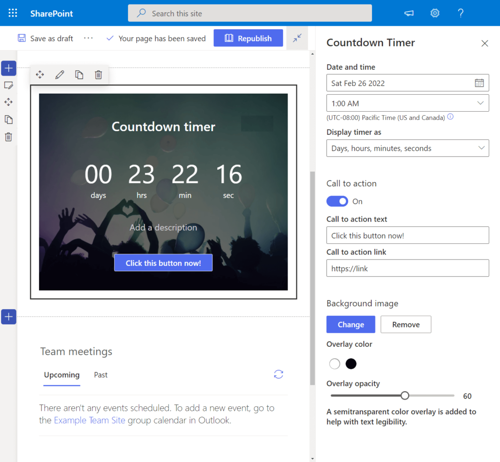
Key features of the Countdown Timer Web Component:
- User-Friendly Setup: Easily configure the following parameters:
- Date and time for the countdown.
- Display preferences for the timer.
- Call-to-action text and corresponding link.
- Background image selection.
- Text color overlay options if the background image is enabled.
- Accessibility Note: Please be aware that the Countdown Timer Web Component is currently part of the target release program, and availability may vary among users.
Document Library
Effortlessly showcase a navigable document library, either in a specific view or directed to a particular folder, using the Document Library Web Component.
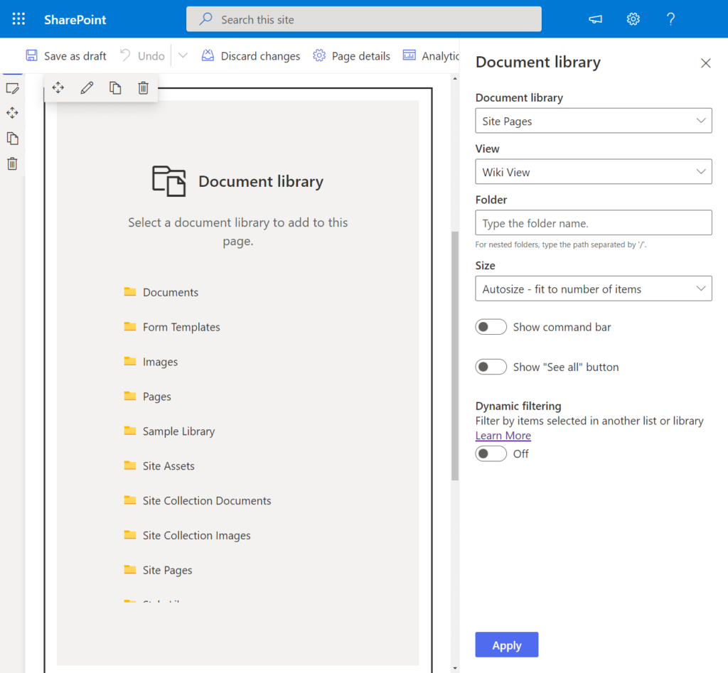
It’s important to note that this web component adheres to the permission levels you have established for your users. Only individuals with the appropriate permissions can view, add, or edit files within the web component.
For users with the necessary access rights, the following actions are available upon selecting a file:
- Download
- Rename
- Delete
- Pin to the top of the library
Additionally, the web component supports dynamic list filtering, enabling you to customize the displayed files based on selections made in another list or library.
Embed
The Embed Web Component offers a versatile solution for presenting content from external sites that support embedding. For well-known platforms like YouTube, a simple link suffices to seamlessly integrate content.
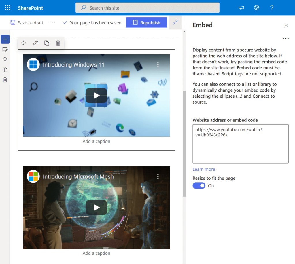
Please be aware that for less mainstream sites, the inclusion of the embed code (iframe-based) is required to ensure proper functionality of this web component.
Notably, the Embed Web Component boasts advanced functionality, enabling you to showcase dynamic content in collaboration with other web parts.
Events
Elevate the visual appeal of your page by incorporating the Events Display Web Component, designed to showcase upcoming events in a modern and stylish format.
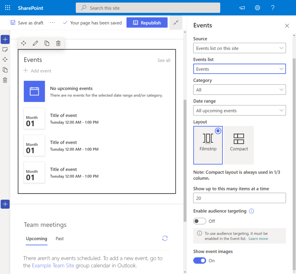
Explore a range of customization options with this web component, including:
- Source Configuration: Choose the origin of the events, specifying details such as the events list, category, and date range.
- Layout Selection: Tailor the appearance of the events section according to your preferences.
- Item Display Settings: Define how many event items are visible simultaneously.
- Audience Targeting: Precisely target your audience based on specific criteria.
- Visual Enhancements: Opt to display event images for a more engaging presentation.
Kindly note that the Events Display Web Component is currently part of the target release program, implying that its availability or appearance may vary among users.
File Viewer
Effortlessly showcase or embed a file directory directly on your page using the File Viewer Web Component.
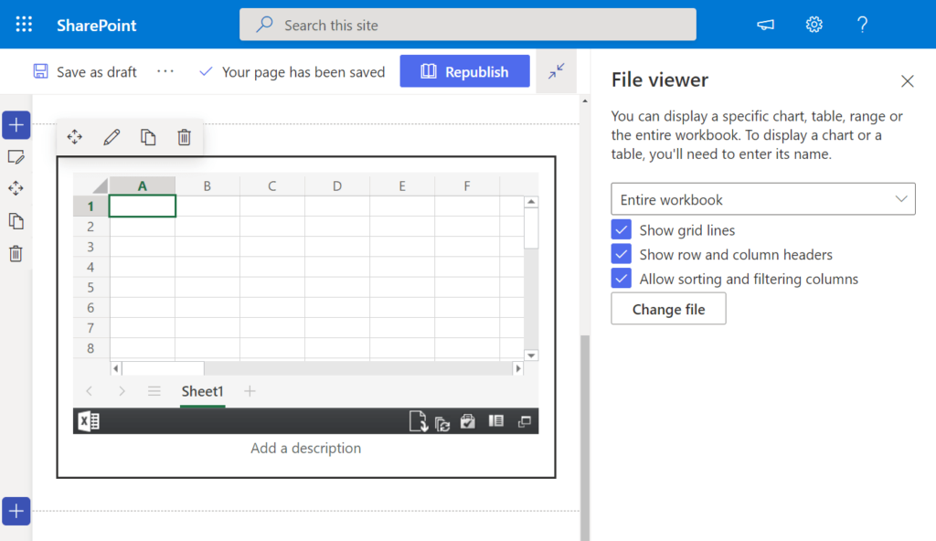
This versatile web component has evolved significantly since its initial release, now supporting an extensive array of file types, including:
- Excel
- Word
- PowerPoint
- Visio
- 3D models
- Videos
The available options in edit mode are contingent on the type of file added. Additionally, you have the capability to upload files directly to the web part.
Important Note: The File Viewer Web Component does not support image files. An alternative web part is available for inserting images onto the page.
Furthermore, dynamic filtering can be employed to showcase files based on user selections in the Document Library Web Component.
Group Calendar
Effortlessly integrate a Microsoft 365 group calendar onto your page with the Group Calendar Web Component, facilitating seamless collaboration by providing teammates with a clear view of upcoming events.
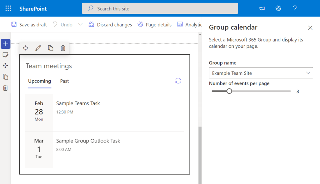
Customize the display by specifying the group name to source events from and configuring the number of events shown per page directly within the web part.
Please note that utilization of the Group Calendar Web Component necessitates the presence of a group, restricting its use to team sites. Events can be conveniently added via Outlook for streamlined management.
Hero Image
The Hero Web Component, typically present on communication sites by default, can be seamlessly added to any modern site page.
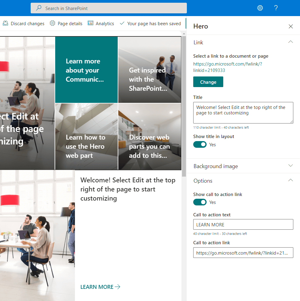
True to its name, the primary purpose of this web component is to captivate attention and generate interest from users, compelling them to focus on the showcased items.
Within the Hero Web Component, you can feature a maximum of five items, including:
- Images
- Links (leading to files, libraries, or even other sites)
- New uploads
Enjoy extensive customization options, such as:
- Adjusting the focal point of an image
- Reordering tiles or layers
- Adding a call to action
This dynamic web component is a powerful tool for engaging users and directing their attention to key content.
Highlighted Content
The Highlighted Content Web Component, often referred to as HCWP and popular among advanced users, offers dynamic content display capabilities, commonly sourced from document libraries, sites, site collections, or even across all sites.
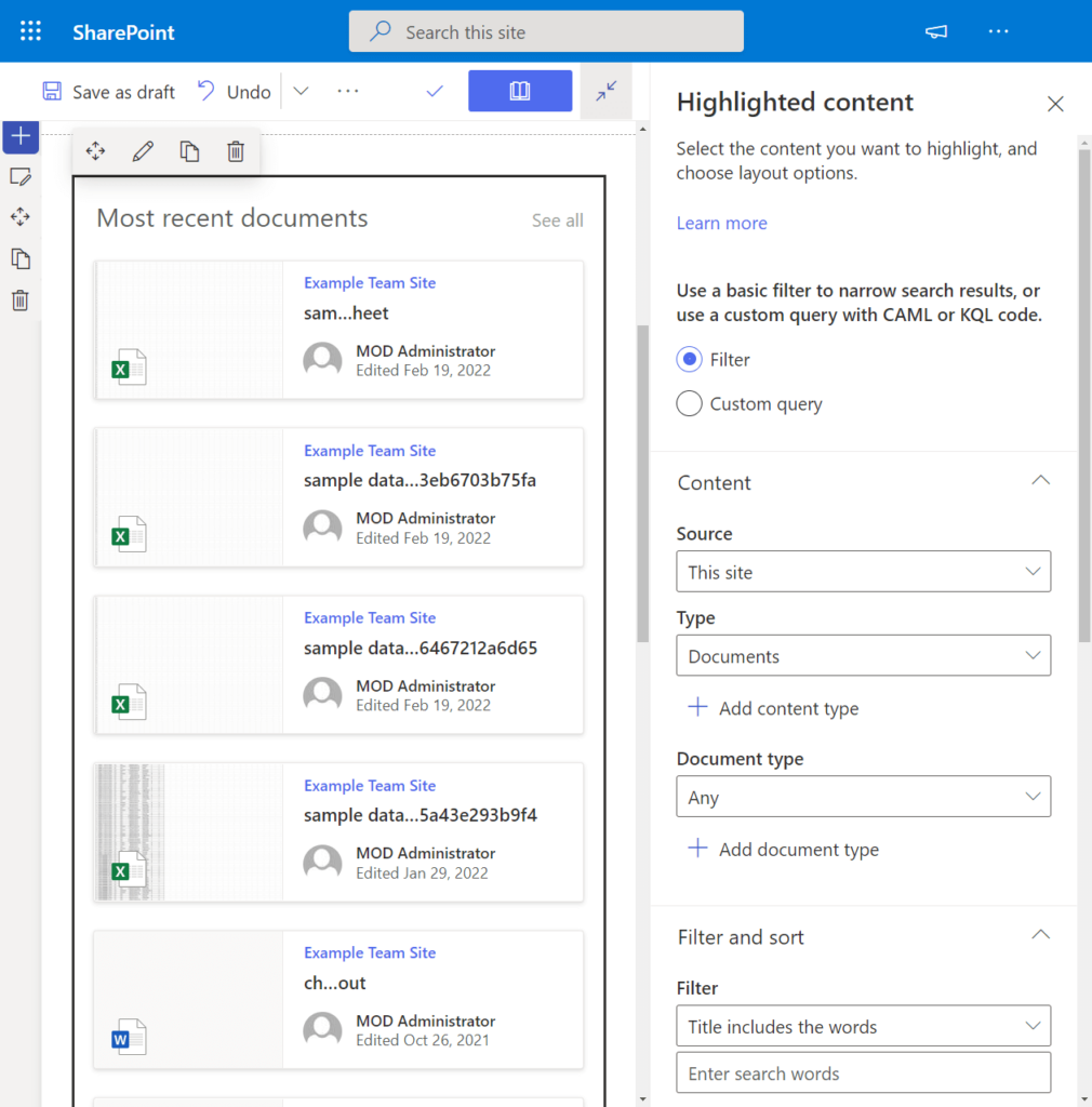
Tailor your content presentation by utilizing either a filter or a custom query to refine search results within the web part.
Filtering Options:
- Content Source, Type, and Document Type: Specify the origin, type, and document type of the content to be highlighted.
- Word Filter: Utilize specific keyword filters to narrow down results.
- Sorting: Arrange content based on defined criteria.
- Audience Targeting: Precisely target your audience based on specific attributes.
Custom Query Options:
- Source: Define the source of the content.
- Query Text (KQL): Employ Keyword Query Language for a detailed search.
- Sorting: Arrange results according to specific parameters.
- Audience Targeting: Refine targeting based on audience characteristics.
Additional customization options include:
- Layout Configuration: Tailor the layout to suit your preferences.
- Show Title and Commands: Choose whether to display titles and associated commands.
- Items Per Page: Define the number of items shown at a time.
- Hide Web Part When Empty: Opt to hide the web part when there is no content to display.
This web component provides a versatile and powerful tool for curating and presenting content dynamically.
Image
The Image Web Component is a straightforward tool, allowing you to effortlessly add images to your page from diverse sources.
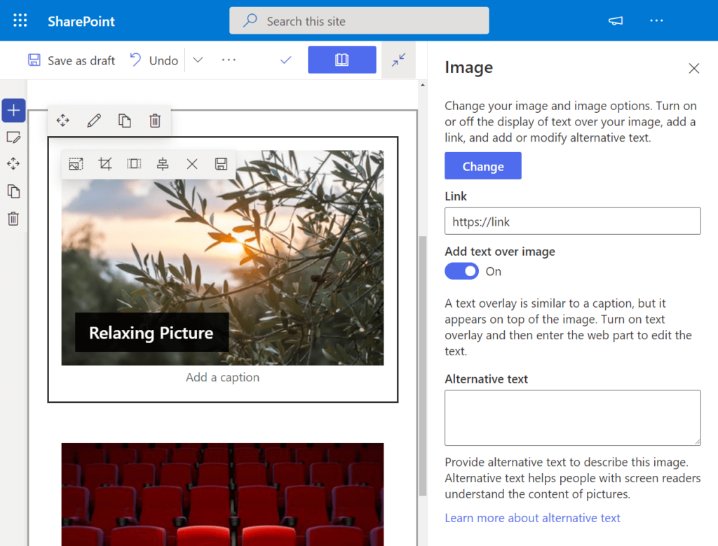
This component supports image inclusion from the following origins:
- Stock images
- Web search
- OneDrive
- Site
- Upload
- From a link
Key features of the Image Web Component include:
- Text Overlay: Display text above the image, akin to a caption, providing additional context.
- Link Integration: Associate a link directly to the image.
- Image Customization: Resize, crop, and adjust the aspect ratio and alignment of the image.
This user-friendly component offers flexibility and creative control over the presentation of images on your page.
Image Gallery
When the need arises to showcase multiple images on your site, the Image Gallery Web Component proves to be a superior choice over the individual Image Web Component.
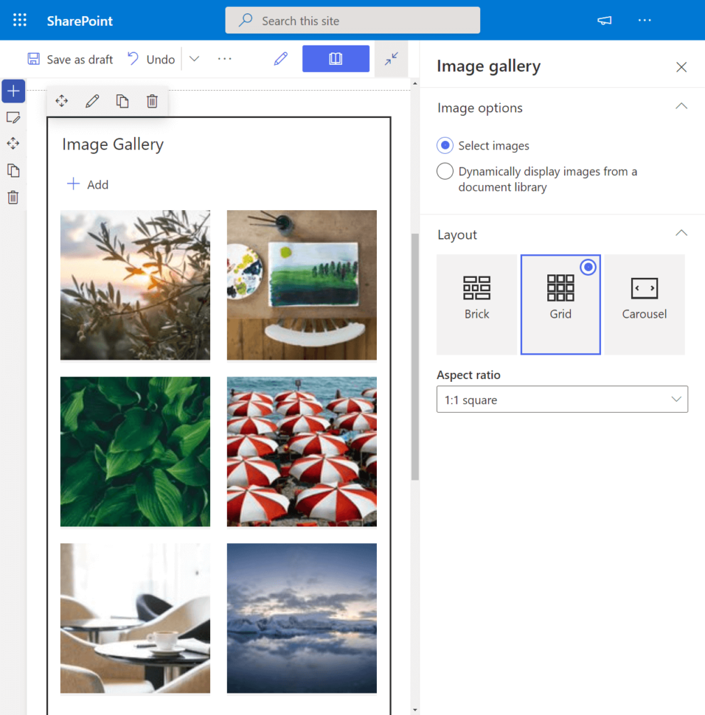
Enjoy the flexibility of adding numerous images from the same sources available for the Image Web Component, with the added benefit of dynamic filtering.
Choose from three distinct layouts:
- Brick
- Grid (with customizable aspect ratio)
- Carousel
For each image within the gallery, personalize the presentation by modifying the:
- Title
- Caption
- Alternative Text (for accessibility)
This comprehensive Image Gallery Web Component empowers you to create visually appealing displays with multiple images while providing detailed customization options for each.
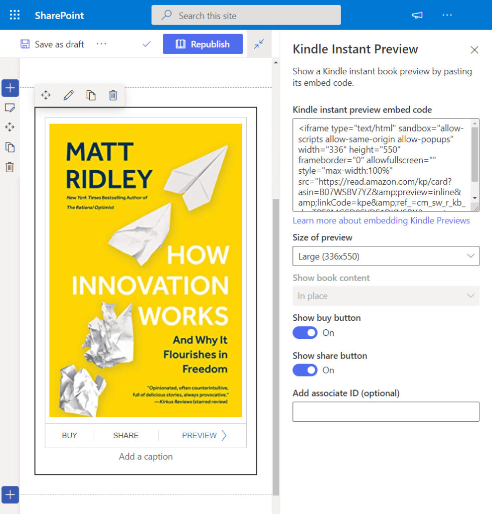
Kindle Instant Preview
Share and recommend books on your site effortlessly with the Kindle Instant Preview Web Component. This versatile web part enables you to showcase a preview of a book from Kindle using an embed code.
Customize the presentation of the book preview with the following options:
- Preview Size: Adjust the size of the book preview for optimal display.
- Book Content: Tailor the content that is included in the preview.
- Buy Button: Optionally include a button for users to purchase the book directly.
- Share Button: Facilitate easy sharing of the book on various platforms.
- Associate ID: Incorporate an affiliate ID for potential commission earnings.
This web component is a valuable tool for book enthusiasts and content creators looking to seamlessly integrate book previews with additional features on their site.
List
The List Web Component provides a convenient way to display or embed a list directly on your page, complete with customizable title, view, and size.
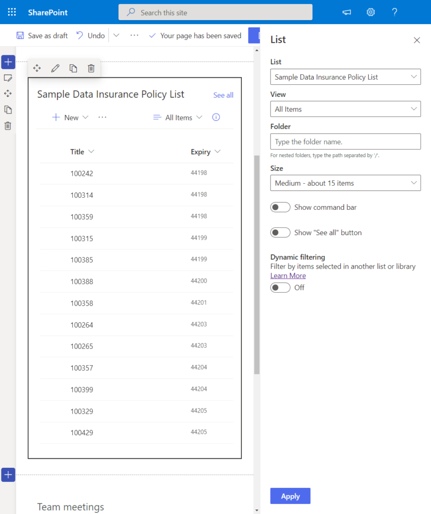
Various list types can be showcased, including:
- Custom lists
- Announcement lists
- Issue tracking lists
- Contact lists
Users interacting with the displayed list can leverage most of its functionality, including the ability to add new items.
Key features of the List Web Component include:
- Title and View Customization: Personalize the title and choose the view for the list.
- Size Adjustment: Modify the size of the embedded list to suit your page layout.
- Command Bar Control: Show or hide the command bar based on your preferences.
- “See All” Button: Decide whether to display or hide the “See All” button for expanded list viewing.
- Dynamic Filtering: Utilize dynamic filtering to tailor the displayed content based on user interactions.
Similar to the Document Library Web Component, the List Web Component offers a versatile and user-friendly approach to incorporating and interacting with lists on your site.
List Properties
True to its name, the List Properties Web Component allows you to display specific properties of a list item that is present on the same page.
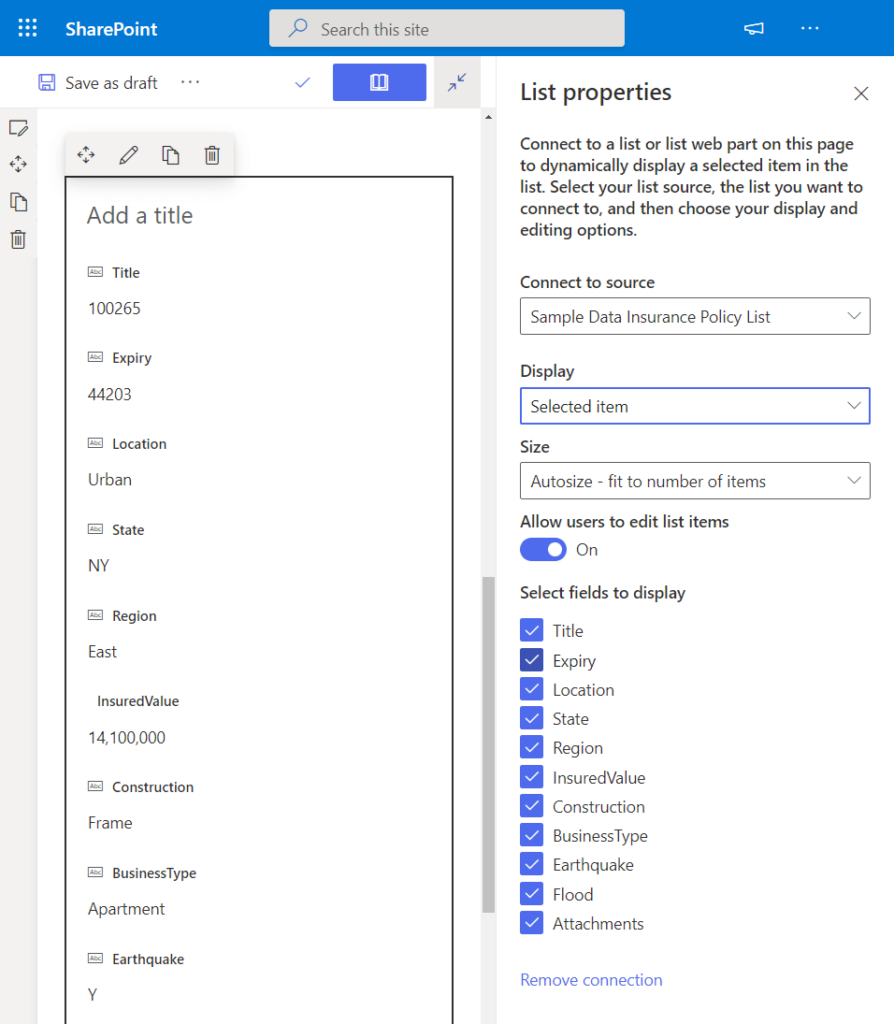
For this web component to function, it requires a list on the same page to serve as its source, akin to the mechanism employed by dynamic filtering.
Customize the behavior of the List Properties Web Component with the following settings:
- Source: Define the source list from which the properties will be extracted.
- Size: Adjust the size of the web part to integrate seamlessly with your page layout.
- Enable Users to Edit List Items: Decide whether users have the ability to edit list items directly from the web part.
- Fields to Display: Select specific fields to display, contingent on the properties of the list.
Microsoft Forms
Empower your page with interactive surveys and polls by utilizing the Microsoft Forms Web Component. This user-friendly tool allows you to seamlessly embed Forms directly onto your page.
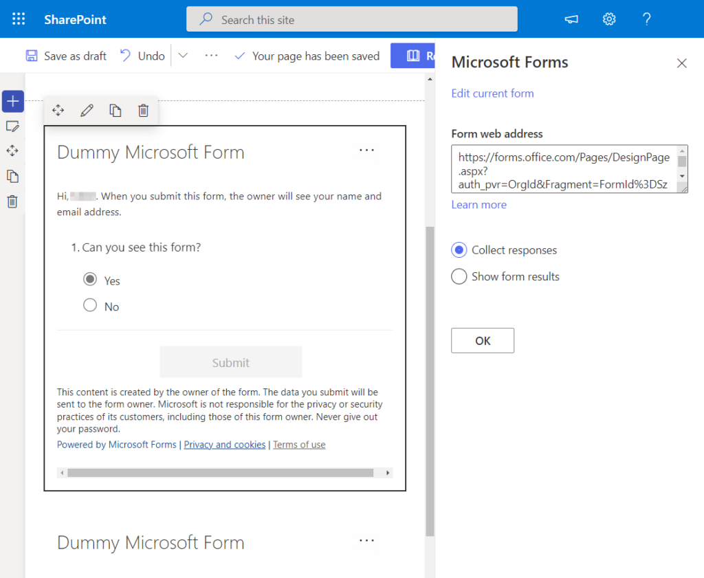
Key features of the Microsoft Forms Web Component include:
- Embedding Capability: Integrate an existing form or create a new one directly within the web part. In the case of creating a new form, you’ll be redirected to Microsoft Forms to complete the process.
- Response Collection: When editing the web part, choose whether to collect responses from site users.
- Results Display: Alternatively, opt to showcase form results directly on the page.
This web component is a valuable asset for gathering feedback, conducting surveys, and engaging your audience directly within your site.
My Feed
The My Feed Web Component is a dynamic element designed to curate and display a personalized feed of content from across the entire Office 365 ecosystem to the user.
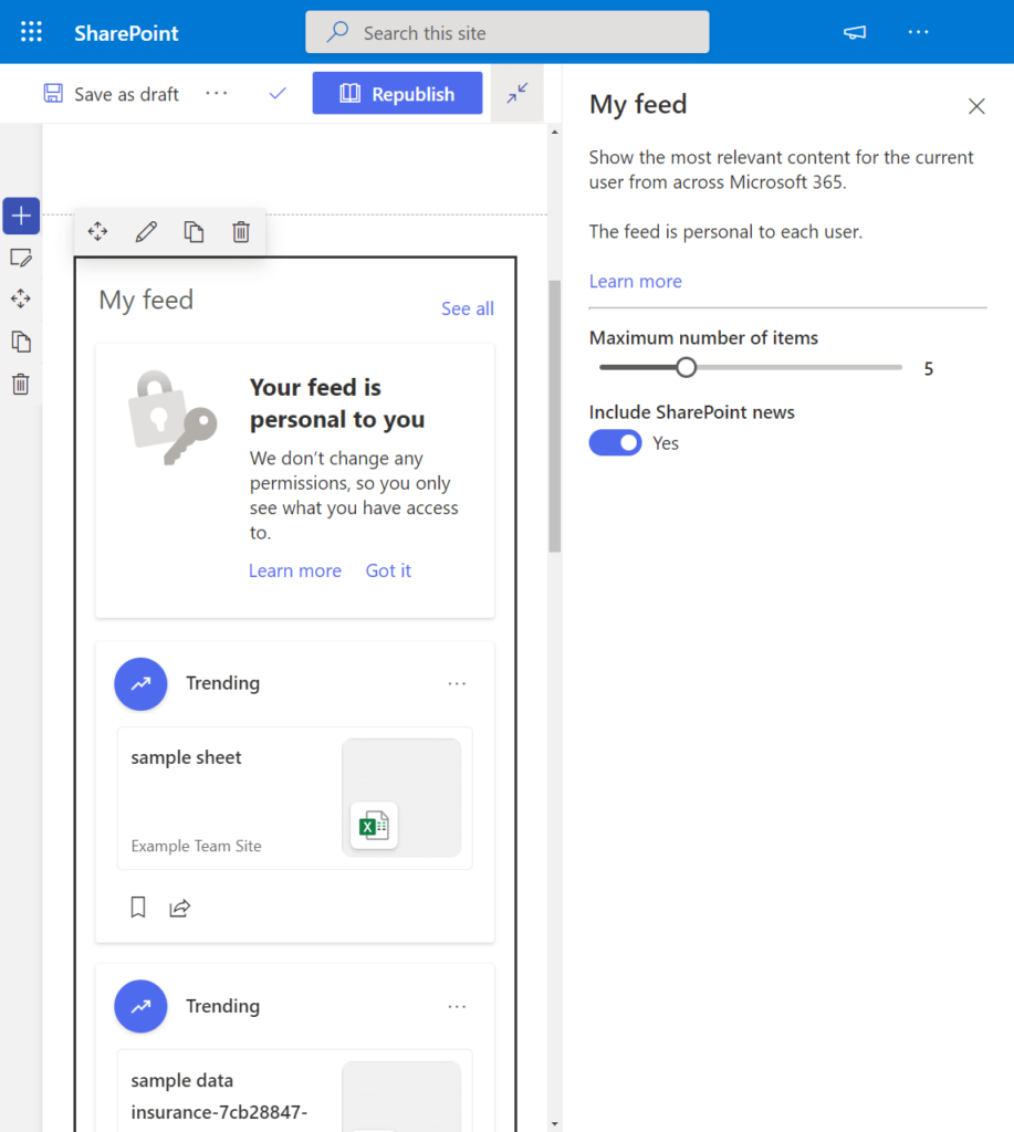
This literal feed offers a snapshot of what’s happening in the company, presenting the most relevant content tailored to the user.
Key features of the My Feed Web Component include:
- Personalization: Dynamically showcases content that is relevant to the specific user.
- Maximum Items Setting: Allows you to edit the maximum number of items displayed to the user.
- News Inclusion: Provides the option to include or exclude news items from the feed.
By leveraging the My Feed Web Component, users can stay informed and engaged with pertinent updates and information from across the Office 365 environment.
News
The News Web Component is a versatile tool commonly employed in communication sites for sharing announcements, status updates, and people news.
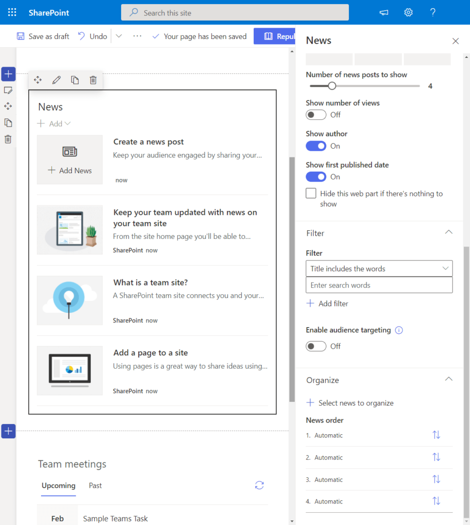
Enjoy a plethora of configuration options with this web component, allowing you to tailor the presentation of news to suit your needs. Key settings include:
- News Source: Select the source of the news, whether it’s from the same site or from other sites within your tenant.
- Layout Customization: Configure various layout options, such as title display, commands, the number of posts to show, and the number of views.
- Filtering: Define specific criteria for filtering the displayed news.
- Audience Targeting: Precisely target your audience based on specific attributes.
- Ordering: Arrange the news posts in a preferred order.
Unique features of the News Web Component include:
- Color Block for Important News: News from official or authoritative sites is distinguished with a unique color block on the title, indicating its significance.
This web component is a valuable asset for communication and information dissemination within the organization.
Organization Chart
The Organization Chart Web Component simplifies the process of adding a visual representation of the company or organization hierarchy directly to your page, utilizing a chart format.
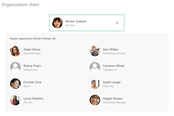
This straightforward web component provides a user-friendly experience with minimal customization options. The primary customization available is adjusting the number of reporting levels.
Key features of the Organization Chart Web Component include:
- Number of Reporting Levels: Customize the depth of the hierarchy by adjusting the number of reporting levels displayed on the chart.
The simplicity of this web component, where you only need to input names and select individuals, makes it an easy-to-use tool for visually representing the organizational structure on your page.
Page Properties
The Page Properties Web Component facilitates the display of information that describes a page, such as the title, product, publisher, and more.
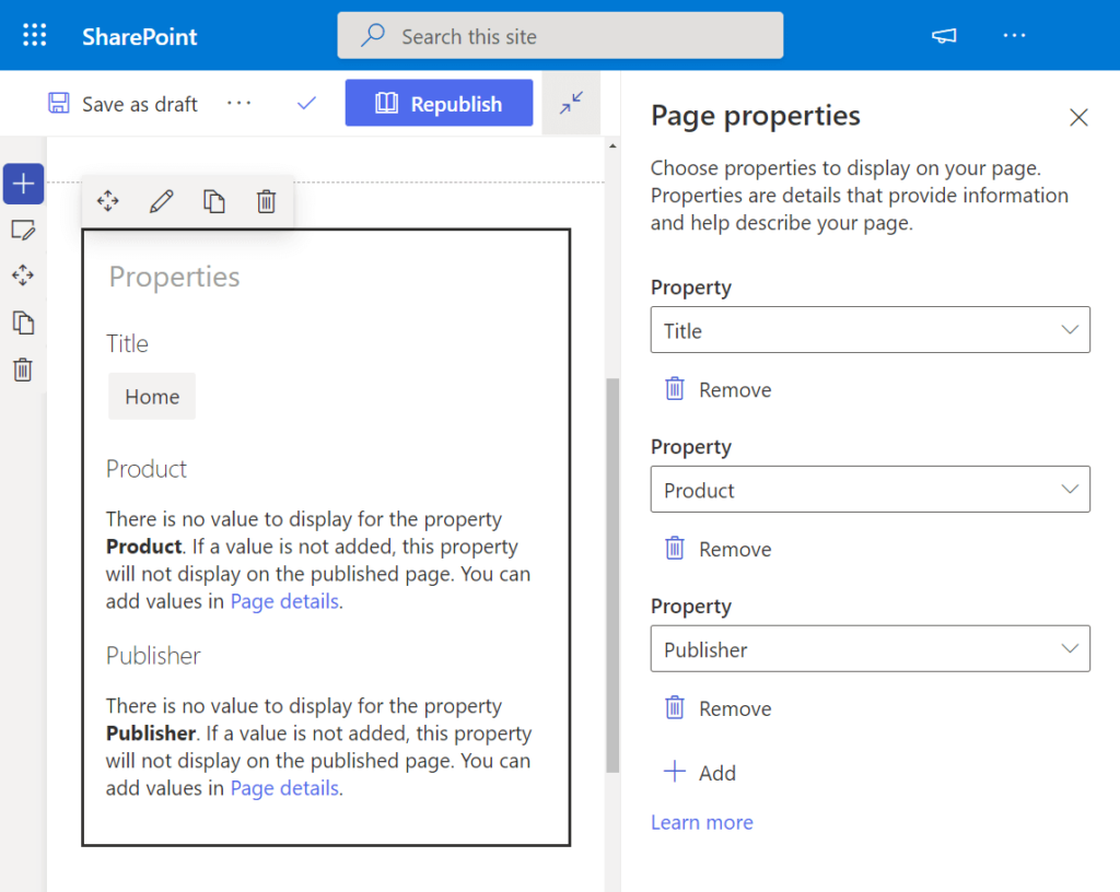
The properties displayed vary, and the Page Properties Web Component supports the following data types:
- Single line of text
- Choice
- Number
- Date and time
- Person or group
- Managed metadata
This web component serves as a valuable tool for presenting essential information about a page, offering flexibility in showcasing diverse types of data.
People
The People Web Component proves to be an effective tool for showcasing specific individuals on your page, providing their contact information and profile link.
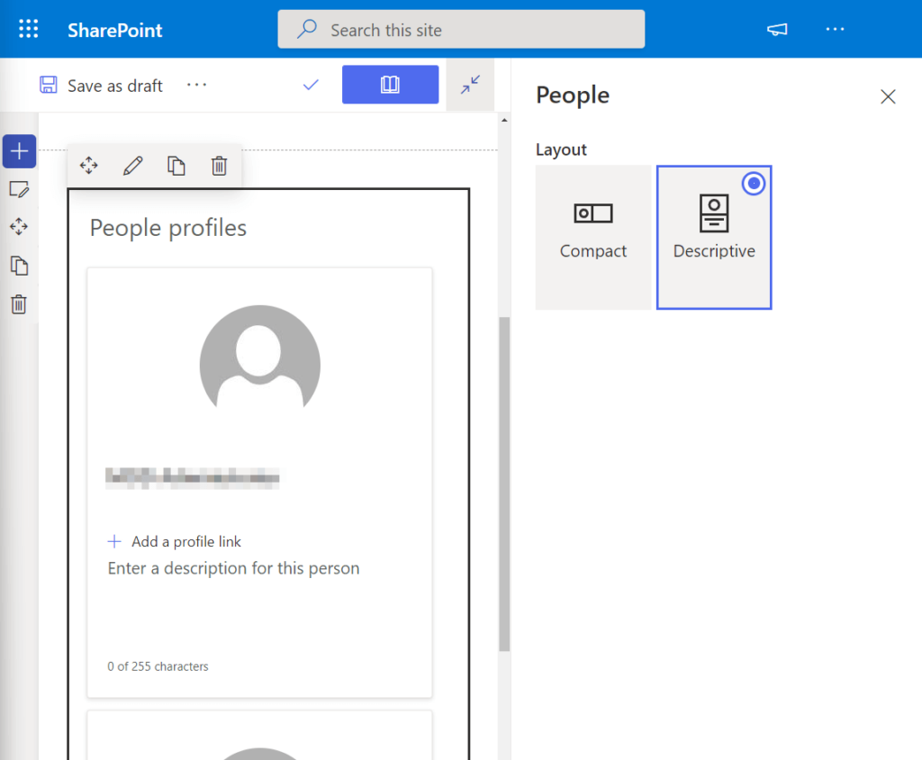
Key functionalities of the People Web Component include:
- Contact Information Display: Showcasing relevant contact details of the specified individuals.
- Profile Link: Providing a direct link to the profiles of the featured individuals.
This web component is particularly useful for scenarios where it’s essential to prominently display key individuals, such as site administrators, for quick and easy access to their contact information.
Planner
The Planner Web Component integrates seamlessly with Microsoft Planner, a robust task management app within the Microsoft 365 suite designed for collaborative team-oriented projects. It offers enhanced capabilities compared to Microsoft To Do.
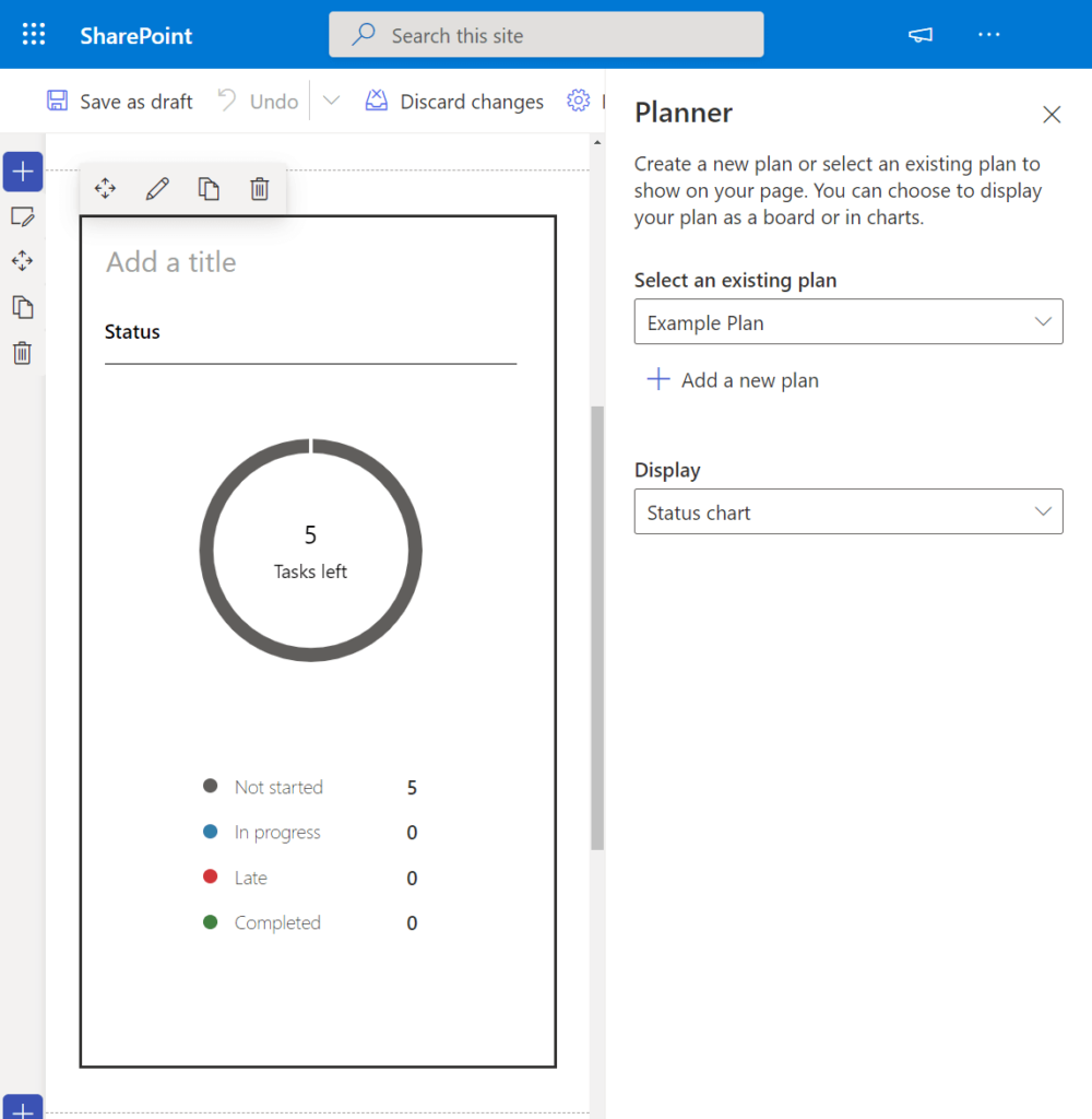
Key functionalities of the Planner Web Component include:
- Integration with Microsoft Planner: Displaying charts or boards directly on your page to keep your team’s progress easily accessible.
- Plan Selection: In edit mode, you can choose an existing plan or create a new one to showcase in the web part.
- Display Options: Customize how the Planner is presented on the page based on your preferences.
Important Notes:
- This web component is exclusive to team sites that have a group.
- It’s currently part of the targeted release program, so some functionality may not be universally available at this time.
The Planner Web Component is a valuable asset for teams leveraging Microsoft Planner for task management, providing a visual representation of their plans within the context of their SharePoint site.
Power Apps
Microsoft Power Apps is a service that empowers users to create business browser apps or other creative solutions without the need for coding knowledge. The Power Apps Web Component allows you to seamlessly integrate these apps into your SharePoint page.
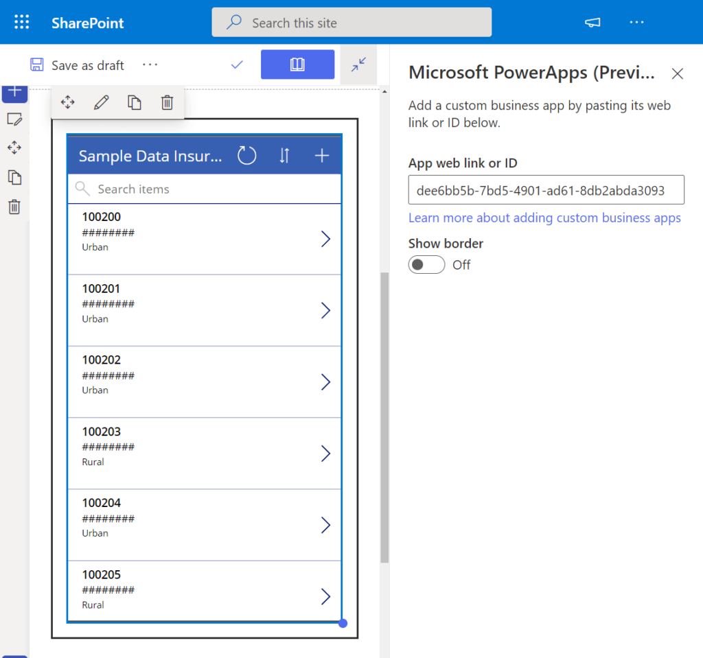
Key considerations when using the Power Apps Web Component:
- Integration with Power Apps: Effortlessly add Power Apps to your page using the app’s web address or ID.
- Access Requirements: Site visitors must have prior access to the app to view it on the page.
- Sizing Considerations: Due to Power Apps being designed with fixed sizes in mind, you may need to manually test and determine the optimal sizes that work well with the app.
This web component offers a convenient way to enhance your SharePoint page with interactive and custom business applications created through Microsoft Power Apps.
Power BI
The Power BI Web Component provides a powerful solution for embedding interactive reports and dashboards created in Microsoft Power BI onto your SharePoint page.
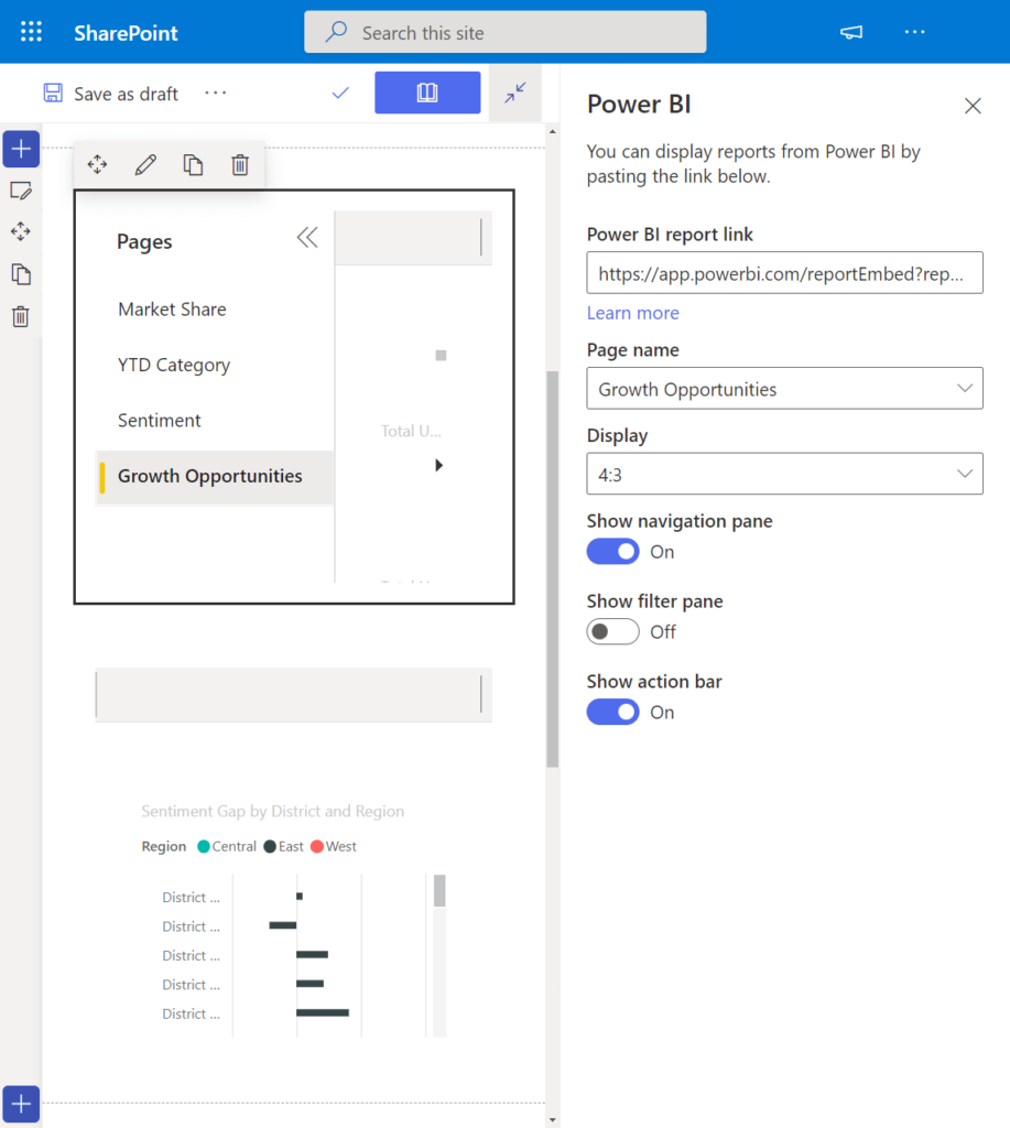
Key features of the Power BI Web Component include:
- Embedding Power BI Reports: Seamlessly integrate Power BI reports by utilizing the report link from Power BI.
- Configuration Options:
- Page Name: Customize the display name for the embedded report on the page.
- Display Size: Adjust the size of the embedded report based on your layout requirements.
- Additional Display Options:
- Navigation Pane: Choose whether to display the navigation pane.
- Filter Pane: Opt to include or exclude the filter pane.
- Action Pane: Decide whether to show the action pane.
Important Considerations:
- The publisher of the report must have a Power BI Pro license.
- Users accessing the reports need appropriate permissions to view them.
This web component is a valuable asset for creating secure internal portals, enabling you to leverage the advanced visualization capabilities of Power BI within your SharePoint environment.
Quick Chart
The Quick Chart Web Component offers a straightforward solution for displaying simple column or pie charts directly on your SharePoint page without the need for creating them in Power BI or Excel.
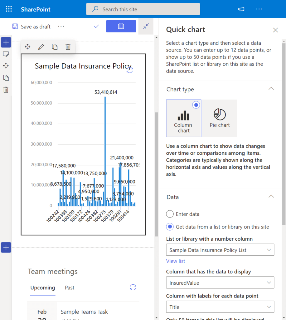
Key features of the Quick Chart Web Component include:
- Data Source Options:
- Enter Your Own Data: Manually input data for the chart.
- Get Data from an Existing List or Library: Utilize data from an existing source on the site.
- Chart Configuration:
- Data Column: Specify the column containing the data to be displayed.
- Labels Column: Identify the column with labels for each data point.
- Sort Order: Define the sort order for the data points (can be none).
- Horizontal Axis Label (for column chart only): Specify the label for the horizontal axis.
- Vertical Axis Label (for column chart only): Provide the label for the vertical axis.
The Quick Chart Web Component is an efficient tool for creating simple visualizations directly on your SharePoint page, making it accessible and user-friendly for a variety of users.
Quick Links
The Quick Links Web Component provides a convenient way to add links to your SharePoint page for quick and easy access. These links can direct users to various destinations, including pages, documents, images, and more.
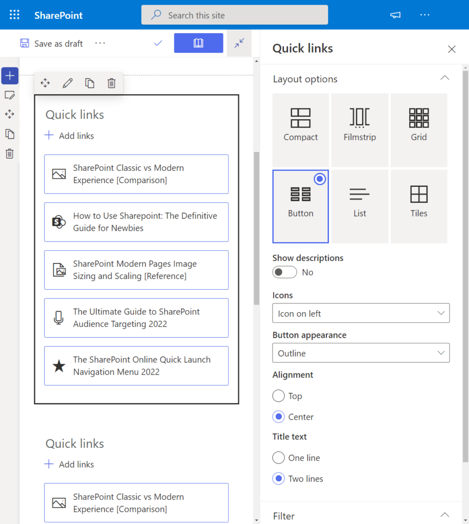
Key features and customization options of the Quick Links Web Component include:
- Layout Options:
- Compact
- Filmstrip
- Grid
- Button
- List
- Tiles
- Appearance Configurations:
- Icons: Customize the icons associated with each link.
- Button Appearance: Configure the visual style of the buttons.
- Alignment: Adjust the alignment of the links on the page.
- Title Text: Customize the title text for the links.
- Audience Targeting: Target specific audiences based on attributes.
- Individual Link Customizations:
- Title: Set a custom title for each link.
- Thumbnail: Choose from auto-selected options, custom images, or icons for thumbnails.
- Alternate Text: Provide alternate text for thumbnail images.
- Description: Add descriptive text for each link.
The Quick Links Web Component offers a versatile and visually appealing solution for organizing and presenting links on your SharePoint page.
Recent Documents
The Recent Documents Web Component allows you to display a list of the most recently accessed documents by the user on the site. This feature provides a convenient and dynamic way to showcase recent activity and document history.
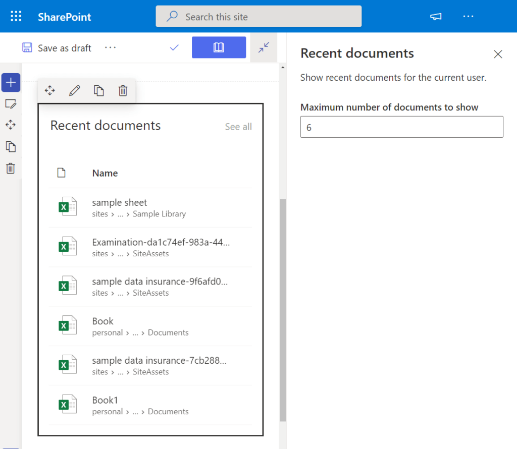
Key features of the Recent Documents Web Component include:
- Maximum Number of Documents: Set a maximum number of documents to be displayed to the user at a given time.
- Dynamic Updates: The web part automatically updates to reflect the user’s most recent document accesses.
This web component is a valuable tool for keeping users informed about their recent document interactions, enhancing user experience and accessibility on the site.
Site Activity
The Site Activity Web Component provides a dynamic solution for showcasing recent site activities, allowing users to easily stay informed about changes and updates within the site.
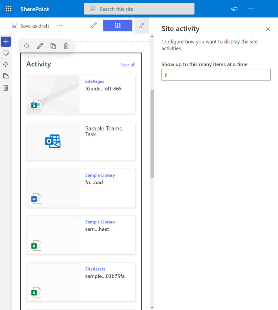
Key features of the Site Activity Web Component include:
- Automatic Display of Recent Activity: The web part automatically presents recent activities on the site, such as new uploads, edits, and list updates.
- Configuration Option:
- Maximum Number of Items: Set the maximum number of items to be displayed at a given time.
This web component serves as an efficient way to keep users in the loop about the most recent changes and activities within the site, fostering transparency and collaboration.
Sites
The Sites Web Component functions as a quick links tool specifically tailored for sites associated with a hub site or the user’s recent sites. It provides a convenient way to showcase and navigate through relevant sites.
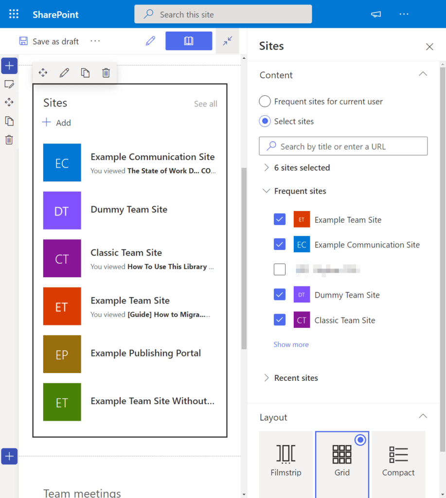
Key features and configurations of the Sites Web Component include:
- Site Selection:
- Show Frequent Sites for the Current User (automatic)
- Select Specific Sites
- Layout Options:
- Filmstrip
- Grid
- Compact
- Visibility Control:
- Hide Web Part if There’s Nothing to Show
- Reordering:
- Reorder the Listed Sites
This web component is an effective tool for presenting and navigating through sites of interest, providing users with a tailored and accessible view of relevant site links.
Text
Despite its name, the Text Web Component is a versatile tool that goes beyond simple text, allowing you to incorporate tables and images seamlessly into your SharePoint page.
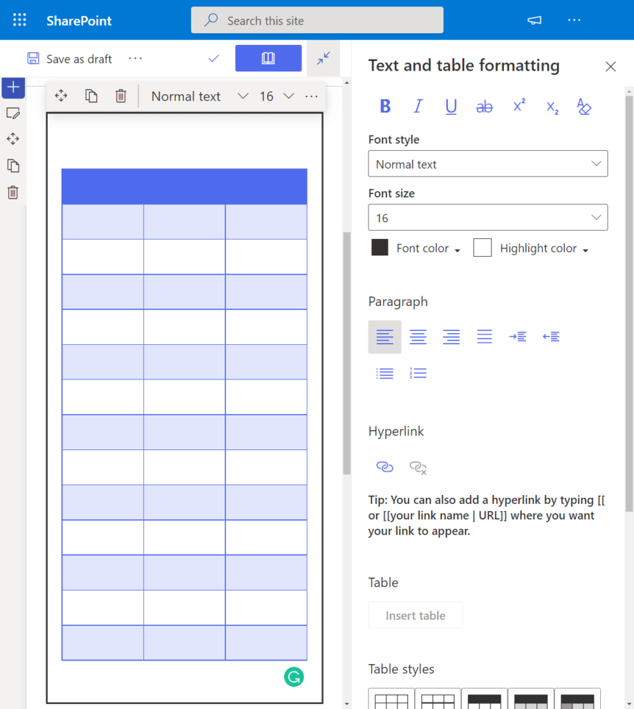
Key features and customization options of the Text Web Component include:
- Content Variety:
- Text: Add various forms of text content, including pull quotes.
- Tables: Easily insert and manipulate tables within the text.
- Images: Embed images directly into the text.
- Robust Customization:
- Alignment: Adjust the alignment of the text, tables, and images.
- Bullets: Include bulleted lists in your content.
- Indents: Customize indentation levels.
- Text Styles: Apply different styles to the text.
- Font Styles: Modify font styles, color, and highlight color.
- Hyperlink: Add hyperlinks to text.
- Table Styles: Customize the appearance and alignment of tables.
The Text Web Component is a comprehensive and flexible solution for adding rich text-based content to your SharePoint page, offering extensive customization options for a polished and tailored presentation.
Weather
The Weather Web Component serves as a functional solution for adding weather information to your SharePoint page, providing users with a quick overview of the weather conditions in specific locations.
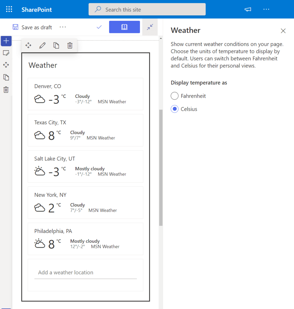
Key features and configurations of the Weather Web Component include:
- Weather Description: The web part describes the weather in a place you specify.
- Temperature Units:
- Fahrenheit
- Celsius
This web component is a useful addition for users who want to quickly access weather information for specific locations without the need to navigate to external weather services.
World Clock
The World Clock Web Component offers a practical solution for displaying the time and day from multiple locations on your SharePoint page, providing users with a quick reference to different time zones.
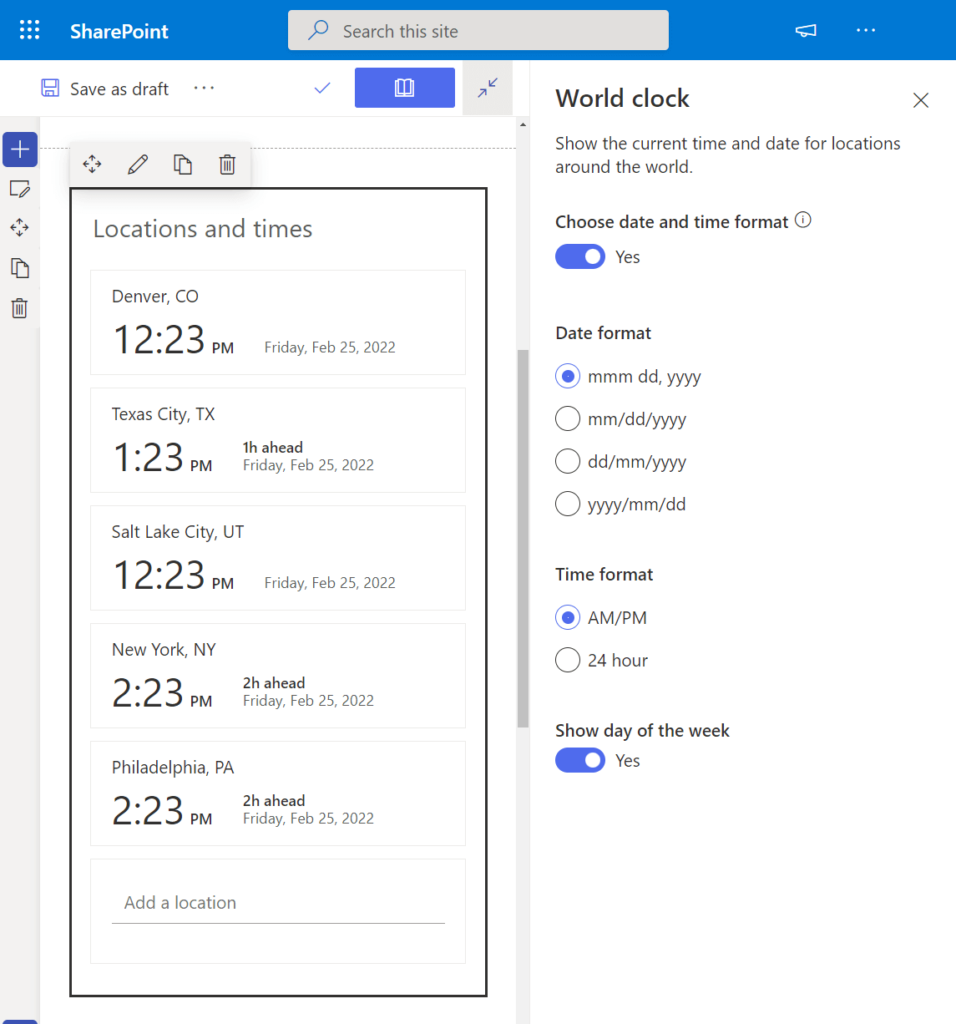
Key configurations of the World Clock Web Component include:
- Time and Day Display:
- Date Format: Configure the format for displaying the date.
- Time Format: Customize the format for displaying the time.
- Show Day of the Week: Toggle the display of the day of the week.
This web component is a valuable tool for users who need to keep track of time differences across various locations, offering a quick and convenient way to reference multiple time zones.
Yammer
In SharePoint, there are two web parts for integrating Yammer into your pages:
- Conversations Web Component:
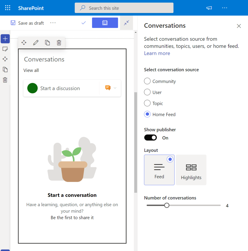
- Key features and configurations:
- Select Conversation Sources: Choose from different conversation sources, such as Community, User, Topic, or Home Feed.
- Layout Options: Switch between feed or highlights layouts.
- Maximum Conversations: Adjust the maximum number of conversations to display.
- Key features and configurations:
- Highlights Web Component:
- Key features and configurations:
- Showcase Overview: Ideal for displaying a quick overview of the latest or top conversations.
- Specific Group or Chosen Conversations: Highlight conversations from a specific group or select conversations of your choice.
- Classic Version: This web part also has a classic version, with the primary difference being the visual appearance.
- Key features and configurations:
These Yammer web components offer versatile options for integrating Yammer conversations seamlessly into SharePoint pages, allowing users to participate in discussions or view highlights directly within the modern SharePoint experience.
YouTube Video
The YouTube Video Web Component provides a straightforward solution for showcasing specific YouTube videos to users on your SharePoint page.
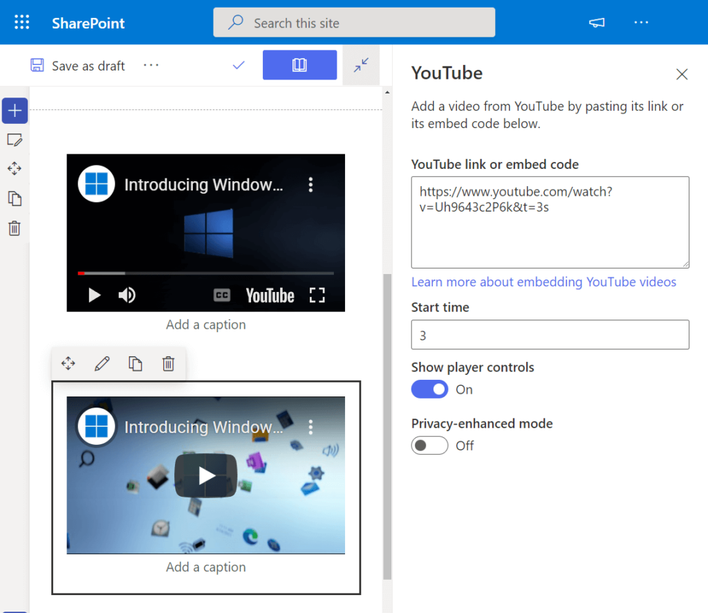
Key features and configurations of the YouTube Video Web Component include:
- Video Display:
- Show a specific YouTube video using its link.
- Optionally, enter the embed code of the video.
- Customization Options:
- Start Time: Adjust the start time of the video.
- Show Player Controls: Toggle the display of player controls on or off.
- Privacy-Enhanced Mode: Enable privacy-enhanced mode for enhanced privacy measures.
This web component is a convenient tool for seamlessly integrating YouTube videos into your SharePoint page, offering flexibility and customization for an optimal viewing experience.